| region | Three "super-classes" of Italy: North, South, and the island of Sardinia |
| area | Umbria, East and West Liguria (North), North and South Apulia, Calabria, and Sicily (South), (inland and coastal Sardinia) |
| palmitic, palmitoleic, stearic, oleic, linoleic, linolenic, arachidic, eicosenoic | fatty acids, % $\times$ 100 |
 .footnote[Ellis (2020) [Surgisphere data fraud fiasco ](https://docs.google.com/presentation/d/1Ls-SsFuFJsGBfvQIcQt7HcojkznaGQN-/edit#slide=id.p5)]
---
background-image: \url(images/week7/covid_HCQ.png)
background-size: 80%
background-position: 50% 5%
---
background-image: \url(images/week7/covid_HCQ.png)
background-size: 80%
background-position: 50% 5%
.footnote[Ellis (2020) [Surgisphere data fraud fiasco ](https://docs.google.com/presentation/d/1Ls-SsFuFJsGBfvQIcQt7HcojkznaGQN-/edit#slide=id.p5)]
---
background-image: \url(images/week7/covid_HCQ.png)
background-size: 80%
background-position: 50% 5%
---
background-image: \url(images/week7/covid_HCQ.png)
background-size: 80%
background-position: 50% 5%
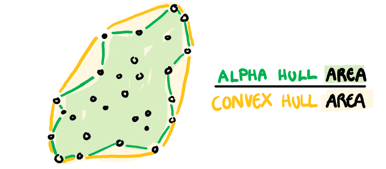 ]
.pull-right[
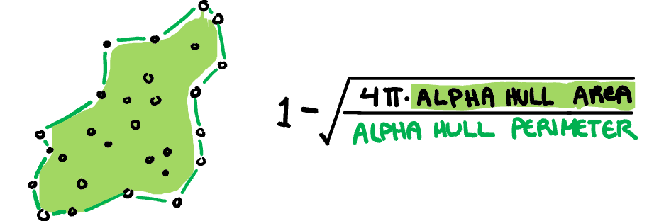
**Skinny:** A measure of how "thin" the shape of the data is. It is calculated as the ratio between the area and perimeter of the alpha hull (A) with some normalisation such that 0 correspond to a perfect circle and values close to 1 indicate a skinny polygon.
$$s_{skinny}= 1-\frac{\sqrt{4\pi area(A)}}{perimeter(A)}$$
]
.pull-right[
**Skinny:** A measure of how "thin" the shape of the data is. It is calculated as the ratio between the area and perimeter of the alpha hull (A) with some normalisation such that 0 correspond to a perfect circle and values close to 1 indicate a skinny polygon.
$$s_{skinny}= 1-\frac{\sqrt{4\pi area(A)}}{perimeter(A)}$$
 ]
.footnote[Sketches made by Harriet Mason]
---
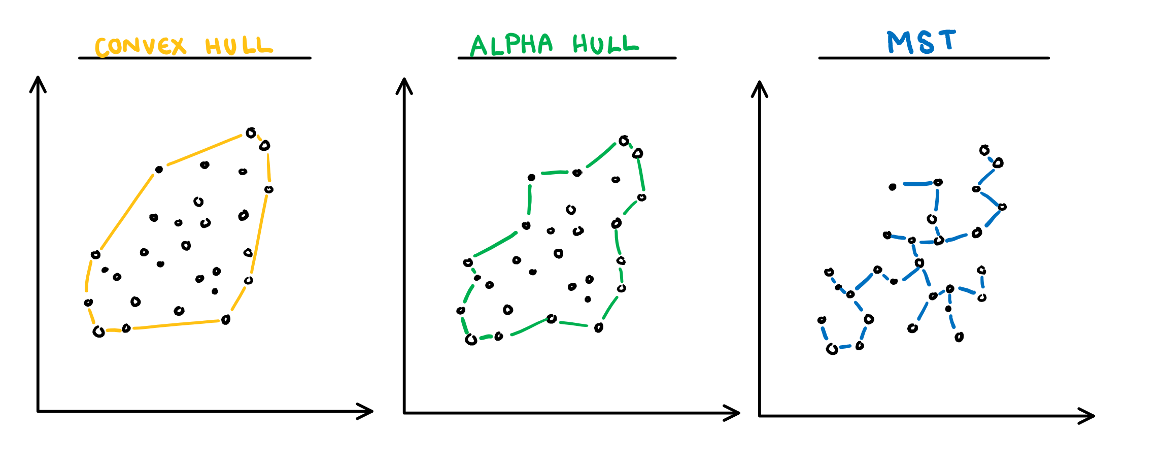
.pull-left[
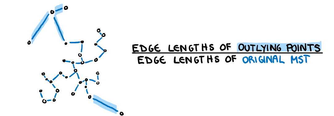
**Outlying:** A measure of proportion and severity of outliers in dataset. Calculated by comparing the edge lengths of the outlying points in the MST with the length of the entire MST.
$$s_{outlying}=\frac{length(M_{outliers})}{length(M)}$$
]
.footnote[Sketches made by Harriet Mason]
---
.pull-left[
**Outlying:** A measure of proportion and severity of outliers in dataset. Calculated by comparing the edge lengths of the outlying points in the MST with the length of the entire MST.
$$s_{outlying}=\frac{length(M_{outliers})}{length(M)}$$
 ]
.pull-right[
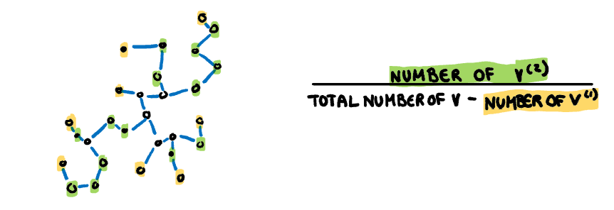
**Stringy:** This measure identifies a "stringy" shape with no branches, such as a thin line of data. It is calculated by comparing the number of vertices of degree two $(V^{(2)})$ with the total number of vertices $(V)$, dropping those of degree one $(V^{(1)})$.
$$s_{stringy} = \frac{|V^{(2)}|}{|V|-|V^{(1)}|}$$
]
.pull-right[
**Stringy:** This measure identifies a "stringy" shape with no branches, such as a thin line of data. It is calculated by comparing the number of vertices of degree two $(V^{(2)})$ with the total number of vertices $(V)$, dropping those of degree one $(V^{(1)})$.
$$s_{stringy} = \frac{|V^{(2)}|}{|V|-|V^{(1)}|}$$
 ]
.footnote[Sketches made by Harriet Mason]
---
.pull-left[
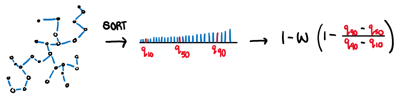
**Skewed:** A measure of skewness in the edge lengths of the MST (not in the distribution of the data). It is calculated as the ratio between the 40% IQR and the 80% IQR, adjusted for sample size dependence.
$$s_{skewed} = 1-w(1-\frac{q_{90}-{q_{50}}}{q_{90}-q_{10}})$$
]
.footnote[Sketches made by Harriet Mason]
---
.pull-left[
**Skewed:** A measure of skewness in the edge lengths of the MST (not in the distribution of the data). It is calculated as the ratio between the 40% IQR and the 80% IQR, adjusted for sample size dependence.
$$s_{skewed} = 1-w(1-\frac{q_{90}-{q_{50}}}{q_{90}-q_{10}})$$
 ]
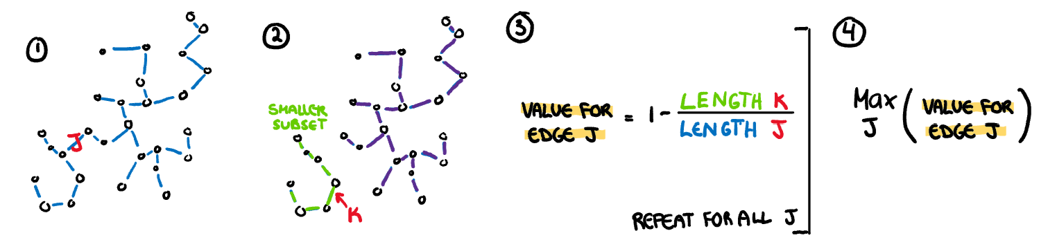
.pull-right[
**Clumpy:** This measure is used to detect clustering and is calculated through an iterative process. First an edge J is selected and removed from the MST. From the two spanning trees that are created by this break, we select the largest edge from the smaller tree (K). The length of this edge (K) is compared to the removed edge (J) giving a clumpy measure for this edge. This process is repeated for every edge in the MST and the final clumpy measure is the maximum of this value over all edges.
$$\max_{j}(1-\frac{\max_{k}(length(e_k))}{length(e_j)})$$
]
.pull-right[
**Clumpy:** This measure is used to detect clustering and is calculated through an iterative process. First an edge J is selected and removed from the MST. From the two spanning trees that are created by this break, we select the largest edge from the smaller tree (K). The length of this edge (K) is compared to the removed edge (J) giving a clumpy measure for this edge. This process is repeated for every edge in the MST and the final clumpy measure is the maximum of this value over all edges.
$$\max_{j}(1-\frac{\max_{k}(length(e_k))}{length(e_j)})$$
 ]
.footnote[Sketches made by Harriet Mason]
---
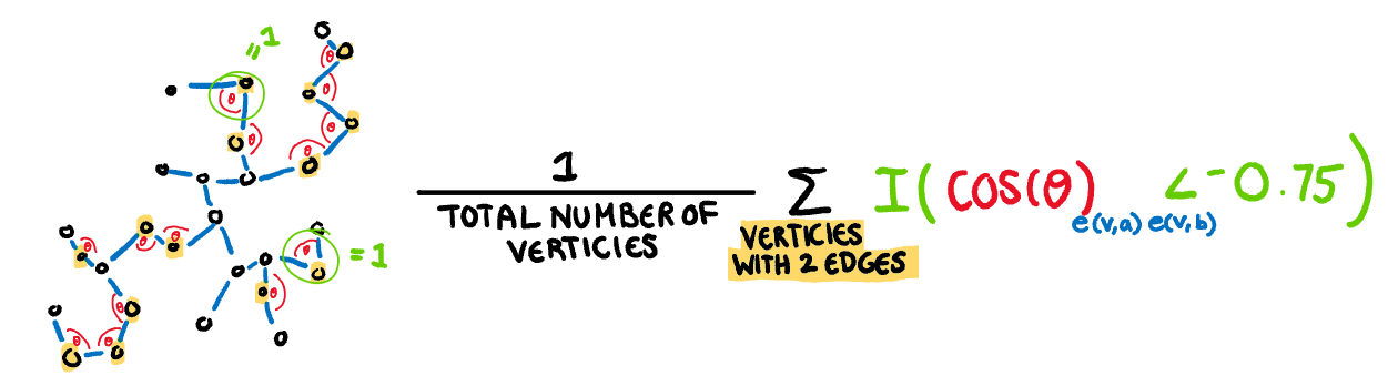
.pull-left[
**Striated:** This measure identifies features such as discreteness by finding parallel lines, or smooth algebraic functions. Calculated by counting the proportion of acute (0 to 40 degree) angles between the adjacent edges of vertices with only two edges.
$$\frac1{|V|}\sum_{v \in V^{2}}I(cos\theta_{e(v,a)e(v,b)}<-0.75)$$
]
.footnote[Sketches made by Harriet Mason]
---
.pull-left[
**Striated:** This measure identifies features such as discreteness by finding parallel lines, or smooth algebraic functions. Calculated by counting the proportion of acute (0 to 40 degree) angles between the adjacent edges of vertices with only two edges.
$$\frac1{|V|}\sum_{v \in V^{2}}I(cos\theta_{e(v,a)e(v,b)}<-0.75)$$
 ]
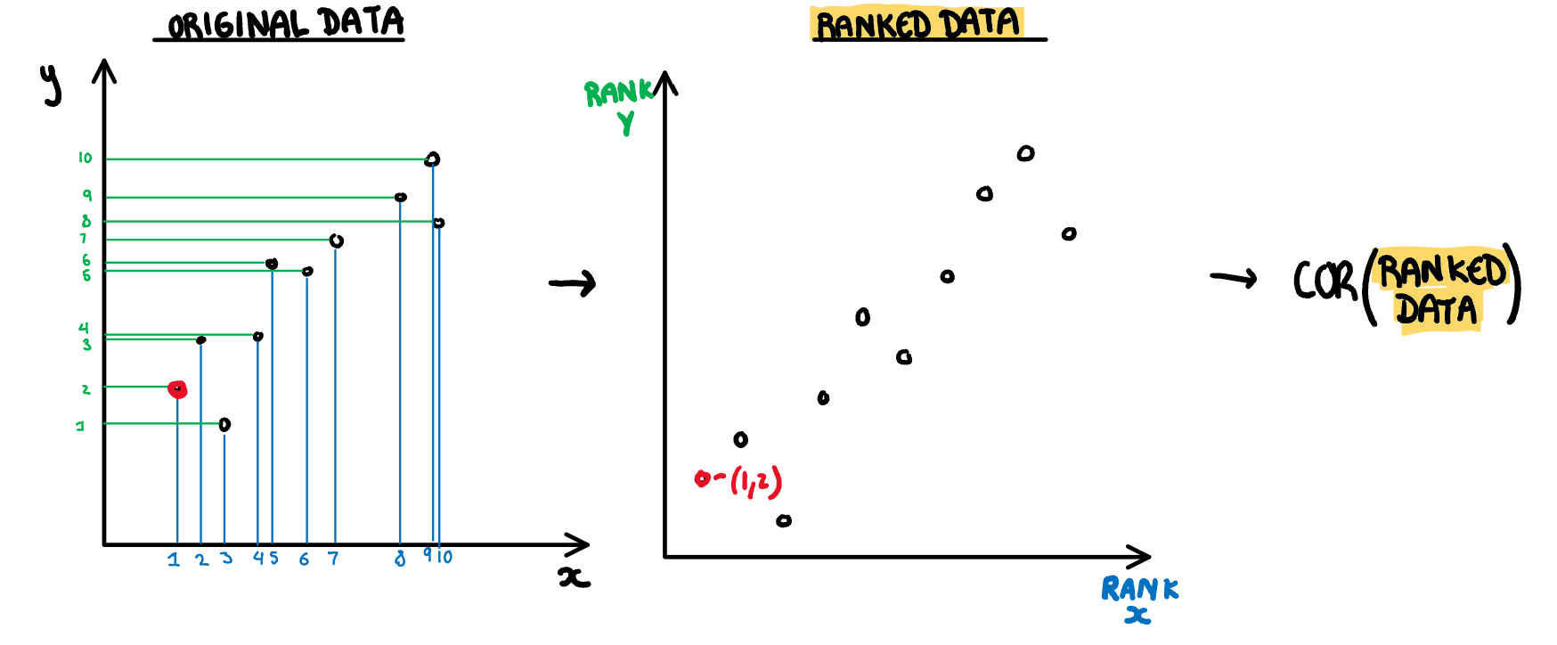
.pull-right[
**Monotonic:** Checks if the data has an increasing or decreasing trend. Calculated as the Spearman correlation coefficient, i.e. the Pearson correlation between the ranks of x and y.
$$s_{monotonic} = r^2_{spearman}$$
]
.pull-right[
**Monotonic:** Checks if the data has an increasing or decreasing trend. Calculated as the Spearman correlation coefficient, i.e. the Pearson correlation between the ranks of x and y.
$$s_{monotonic} = r^2_{spearman}$$
 ]
.footnote[Sketches made by Harriet Mason]
---
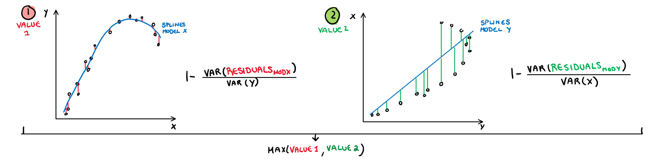
.pull-left[
**Splines:** Measures the functional non-linear dependence by fitting a penalised splines model on X using Y, and on Y using X. The variance of the residuals are scaled down by the axis so they are comparable, and finally the maximum is taken. Therefore the value will be closer to 1 if either relationship can be decently explained by a splines model.
$$s_{splines}=\max_{i\in x,y}[1-\frac{Var(Residuals_{model~i=.})}{Var(i)}]$$
]
.footnote[Sketches made by Harriet Mason]
---
.pull-left[
**Splines:** Measures the functional non-linear dependence by fitting a penalised splines model on X using Y, and on Y using X. The variance of the residuals are scaled down by the axis so they are comparable, and finally the maximum is taken. Therefore the value will be closer to 1 if either relationship can be decently explained by a splines model.
$$s_{splines}=\max_{i\in x,y}[1-\frac{Var(Residuals_{model~i=.})}{Var(i)}]$$
 ]
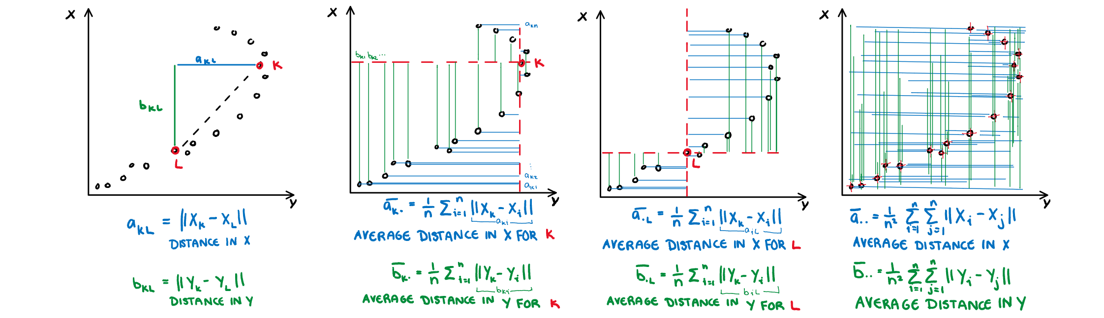
.pull-right[
**Dcor:** A measure of non-linear dependence which is 0 if and only if the two variables are independent. Computed using an ANOVA like calculation on the pairwise distances between observations.
$s_{dcor}= \sqrt{\frac{V(X,Y)}{V(X,X)V(Y,Y)}}$
where
$V(X,Y)=\frac{1}{n^2}\sum_{k=1}^n\sum_{l=1}^nA_{kl}B_{kl}$,
$A_{kl}=a_{kl}-\bar{a}_{k.}-\bar{a}_{.j}-\bar{a}_{..}$
$B_{kl}=b_{kl}-\bar{b}_{k.}-\bar{b}_{.j}-\bar{b}_{..}$
]
.pull-right[
**Dcor:** A measure of non-linear dependence which is 0 if and only if the two variables are independent. Computed using an ANOVA like calculation on the pairwise distances between observations.
$s_{dcor}= \sqrt{\frac{V(X,Y)}{V(X,X)V(Y,Y)}}$
where
$V(X,Y)=\frac{1}{n^2}\sum_{k=1}^n\sum_{l=1}^nA_{kl}B_{kl}$,
$A_{kl}=a_{kl}-\bar{a}_{k.}-\bar{a}_{.j}-\bar{a}_{..}$
$B_{kl}=b_{kl}-\bar{b}_{k.}-\bar{b}_{.j}-\bar{b}_{..}$
 ]
.footnote[Sketches made by Harriet Mason]
---
# Scagnostics from familiar measures
There are many more ways to numerically characterise association that can be used as scagnostics too:
- We used those available in the [vaast]() R package
- Slope, intercept, and error estimate from a simple linear model
- Correlation
- Principal component analysis: first eigenvalue
- Linear discriminant analysis: Between group SS to within group SS
- Cluster metrics
- Also see
- tignostics for time series ([feasts](https://feasts.tidyverts.org) R package)
- longnostics for longitudinal data ([brolgar](http://brolgar.njtierney.com) R package)
---
# Resources
- Friendly and Denis "Milestones in History of Thematic Cartography, Statistical Graphics and Data Visualisation" available at http://www.datavis.ca/milestones/
- Schloerke et al (2020). GGally: Extension to
'ggplot2'. https://ggobi.github.io/ggally.
- Wilkinson, Anand, Grossmann (1994) Graph-Theoretic Scagnostics, http://papers.rgrossman.com/proc-094.pdf
- Grimm, K. (2016). Kennzahlenbasierte grafikauswahl (pp. III, 210) [Doctoral thesis]. Universität Augsburg.
- Hofmann et al (2020) binostics:
Compute Scagnostics. R package version 0.1.2.
https://CRAN.R-project.org/package=binostics
- O'Hara-Wild, Hyndman, Wang
(2020).
https://CRAN.R-project.org/package=fabletools
- Tierney, Cook, Prvan (2020)
https://github.com/njtierney/brolgar
---
```{r endslide, child="assets/endslide.Rmd"}
```
]
.footnote[Sketches made by Harriet Mason]
---
# Scagnostics from familiar measures
There are many more ways to numerically characterise association that can be used as scagnostics too:
- We used those available in the [vaast]() R package
- Slope, intercept, and error estimate from a simple linear model
- Correlation
- Principal component analysis: first eigenvalue
- Linear discriminant analysis: Between group SS to within group SS
- Cluster metrics
- Also see
- tignostics for time series ([feasts](https://feasts.tidyverts.org) R package)
- longnostics for longitudinal data ([brolgar](http://brolgar.njtierney.com) R package)
---
# Resources
- Friendly and Denis "Milestones in History of Thematic Cartography, Statistical Graphics and Data Visualisation" available at http://www.datavis.ca/milestones/
- Schloerke et al (2020). GGally: Extension to
'ggplot2'. https://ggobi.github.io/ggally.
- Wilkinson, Anand, Grossmann (1994) Graph-Theoretic Scagnostics, http://papers.rgrossman.com/proc-094.pdf
- Grimm, K. (2016). Kennzahlenbasierte grafikauswahl (pp. III, 210) [Doctoral thesis]. Universität Augsburg.
- Hofmann et al (2020) binostics:
Compute Scagnostics. R package version 0.1.2.
https://CRAN.R-project.org/package=binostics
- O'Hara-Wild, Hyndman, Wang
(2020).
https://CRAN.R-project.org/package=fabletools
- Tierney, Cook, Prvan (2020)
https://github.com/njtierney/brolgar
---
```{r endslide, child="assets/endslide.Rmd"}
```